Talking about fiddling your way to disaster. They should give Jay Powell the booby-prize and be done with it. That’s because the signs of a resurgent inflationary tide are everywhere, yet this mindless money-printer just can’t keep his hands off the interest rate lever, which has already been fiddled way too low for way too long.
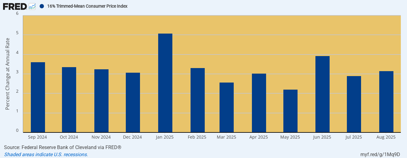
The fact is, our trusty 16% trimmed mean CPI has posted at or above 3.0% for 10 of the last 12 months. And, no, the bars shown below are not rearview mirror snapshots tracking the trailing 12 months. To the contrary, they depict the annualized run rate during the current month—with a different set of the highest 8% and lowest 8% of CPI basket items eliminated each month.
So you can’t get a better, smoother instantaneous reading of the inflation trend. Yet each month for the past year this index has been shouting that inflation is not getting better; and that if you stay on the current 3% path you will increase the price level by 35% every decade.
Stated differently, cutting already low real interest rates in the jaws of the inflation trend shown in the graph below is smoking gun evidence–if any is needed—that in the hands of Keynesian academics and politicized apparatchiks the Fed has become an Infernal Inflation Machine.
Monthly Trimmed Mean CPI Increase, Annualized, September 2024 to August 2025
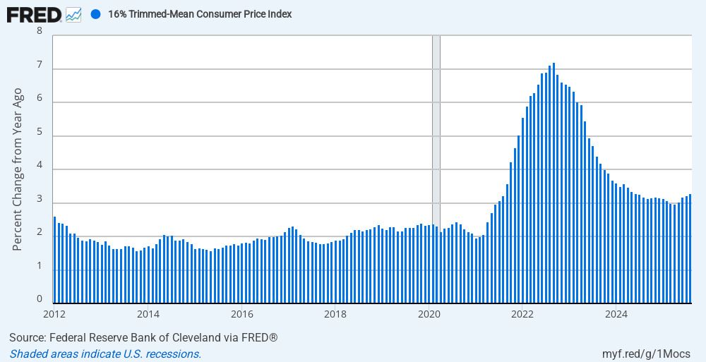
The graph below puts this short-term inflation trend in perspective. Self-evidently, the trend level after the Fed adopted the explicit pro-inflation “goal” of 2.00% has now become a 50% higher de facto level of 3.0%. Needless to say, however, 3% per year is not a sustainable inflation rate—so if you are a central banker even mildly committed to sound money, the last thing you would do at this point is cut the Federal funds rate.
That’s especially the case after the 2021-2023 inflation readings went to 40-year highs in the range of 7-8%. And they did so with no subsequent chance whatsoever for main street households and businesses to recoup even a smattering of the purchasing power lost during the surge shown in the graph below.
Y/Y Inflation Rate, 2012 to 2025
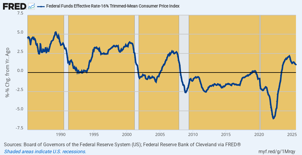
So what we really have is an Eccles Building ukase proclaiming that the American economy can’t stand inflation-adjusted money market rates that are even a tad above the zero bound. Of course, that’s ridiculous as a matter of historic fact and economic logic, but this week’s rate cut allows no other conclusion—not when the inflation-adjusted money market rate is still barely positive after decades of zero or negative real rates. In fact, during the 182 months between March 2008 and May 2023 the Fed funds rate was positive in real terms during only 6 months.
Now for crying out loud. The overarching purpose of the nation’s central bank going way back to its enactment in December 1913 was to preserve a sound currency. Yet there is no economic theory in the known universe that says you can maintain a sound currency when the central bank keeps money market rates below zero in real terms for 97% of the time over 15 years running.
Moreover, it is also empirically evident that the current negligible +1.04% real Fed funds rate as of August is no threat to jobs, growth and main street prosperity. After all, during much of the time between 1985 and 2000, the real Fed funds rate ranged between+2.5% and +5.0%, even as the real GDP growth rate during that period expanded at a robust 3.4% per annum.
So the big rate cuts last fall and now this additional one (with two more promised before year-end) are simply proof in the pudding. The nation’s central bank is rigidly and religiously pro-inflation, and eventually that will bring the ruin of free market prosperity.
Inflation-Adjusted Federal Funds Rate, 1985 to 2025
The obvious problem with Keynesian central banking, of course, is that it is almost exclusively pre-occupied with short run rates of change in inflation and job creation, when what really matters is the longer-term trend. That is to say, a minimal rise in the price level and maximal gains in real economic output, jobs and household incomes over time.
On the inflation front, especially, the short-run rate of change is surely the worst metric imaginable because it basically assumes that the world starts over every month, quarter or even year. Indeed, as the Fed has practiced its 2.00% inflation targeting there is no catch-up from bursts of high inflation or symmetry over time at all.
That is, under a symmetrical application of the 2.00% inflation goal there would logically be a catch-up period of lower inflation after the extended period of 4-8% inflation readings in 2021-2023. That is, a symmetrical annual inflation “goal” would merit at least some period of “under-shooting” of the 2.00% target. That’s because what actually impacts longer-term macro-economic performance and real household living standards is the rise of the price level over three, five and ten year intervals.
Actually, however, the Fed’s asymmetry in practice is far worse. Back before 2020 when the annual inflation rate by some measures was running slightly below the 2.00% target, the Fed heads had no problem talking about “averaging up” via overshooting the annual goal, and even for awhile announced an “average-over-time” definition of the 2.00% target. But now that we are far to the upside of the target number not so much as even a whisper about “averaging down” has emanated from the Eccles Building.
Another problem with the short-term inflation target is that the Fed has cherry-picked an inflation yardstick—the PCE deflator—-that is the shortest ruler available, and which doesn’t even measure price change for a constant basket of goods and services over time. The latter, of course, is the very definition of inflation as a change in the general price level.
What the PCE deflator actually captures is not apples-to-apples price change for a fixed mix of goods and services, but the effects of households and businesses on the free market taking steps to adjust to rising prices. That is to say, the effect of buying chicken not steak at the grocery story; econo-boxes not fully tricked-out sedans at the dealer lots; and going to the Cracker Barrel rather than Ruth’s Chris Steak House when dinning out.
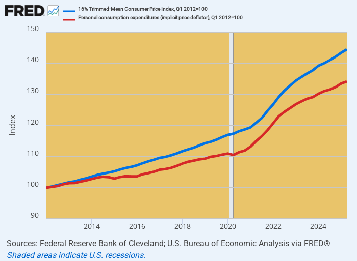
Needless to say, on a one-quarter or one year basis, the differences between the PCE deflator and the 16% trimmed mean CPI are marginal, representing a handful of basis point. But when accumulated over time, the gap between these measures of the general price level systematically widens, and materially so. During just the 13-years since the Fed officially adopted its 2.00% inflation target, the PCE deflator (red line) has risen by 34%, while the 16% trimmed mean CPI (blue line) is up by 44%.
In short, the Fed is targeting mucho inflation—with the 16% trimmed mean CPI up by 2.8% per annum during the period. But it claims to have nearly hit it target because the short-ruler PCE deflator—which is called the Fed’s “preferred” inflation measure for an obvious reason—-rose by only 2.1%during the first decade and one-half of its official inflation targeting policy.
Cumulative Rise In The 16% trimmed mean CPI versus PCE Deflator, 2012 to 2025
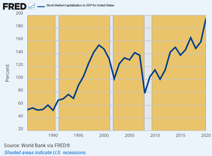
Either way, there is simply no economic rationale for that much cumulative rise on the main street price level over the last 13.5 years. And that’s to say nothing of the Wall Street Price level, which relative to GDP is up by 4X from its mid-1980s level.
That’s right. At the peak of the Reagan Boom in 1986, when inflation was running below 2% and real GDP was expanding by upwards of 4% annually there was no reason to believe that the booming stock market at the time was under-valued at about 55% of GDP. Yet after the era of Greenspanian monetary central planning became fully entrenched in the 1990s and especially after the dotcom bust of 2001, the stock market capitalization relative to underlying national income kept ratcheting ever higher and never looked back.
Accordingly, by the 1999 dotcom peak the US stock market capitalization had reached 153% of GDP and after the correction of the Financial Crisis surged to 195% by 2020. And not shown in the chart, the US stock capitalization at Friday’s market close reached $62.8 trillion, which is now equal to209% of national income.
Yet and yet. Is there any reason to believe that the US economy is healthier today or that the national income has higher growth capacity with 3% inflation, 1.5% real GDP growth and $104 trillion of public and private debt equal to 355% of GDP than it had in 1986? Back then the inflation rate was far lower and falling, while real GDP growth was more than double current levels and total debt amounted to only $10 trillion or 210% of GDP.
In short, what we have experienced since 1986 is a vast expansion of stock market valuation multiples relative to national income that has drastically distorted capital markets and resource allocation across the entire warp and woof of the US economy. Not only is this setting up Wall Street for the greatest crash ever, but when combined with a shrinking labor force, swelling Welfare State and $104 trillion of public and private debt it is systematically impairing the stability and growth capacity of the main street economy.
Ratio Of US Stock Market Capitalization To GDP, 1986 to 2020
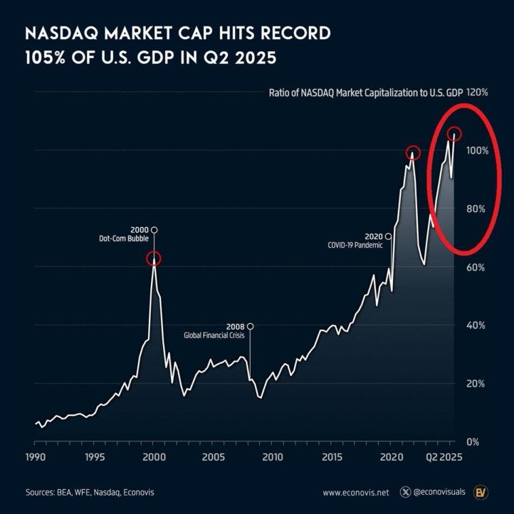
For want of doubt, here is another measure of the massive inflation in the nation’s financial markets. The NASDAQ capitalization relative to GDP has literally shot the moon. It has risen from 10% of GDP in the late 1980s to 60% of GDP at the dotcom peak, but has now soared into an altogether different universe: Driven by the AI craze the market capitalization of NASDAQ now stands at 120% of GDP.
NASDAQ Market Cap As % Of GDP, 1990 to 2025
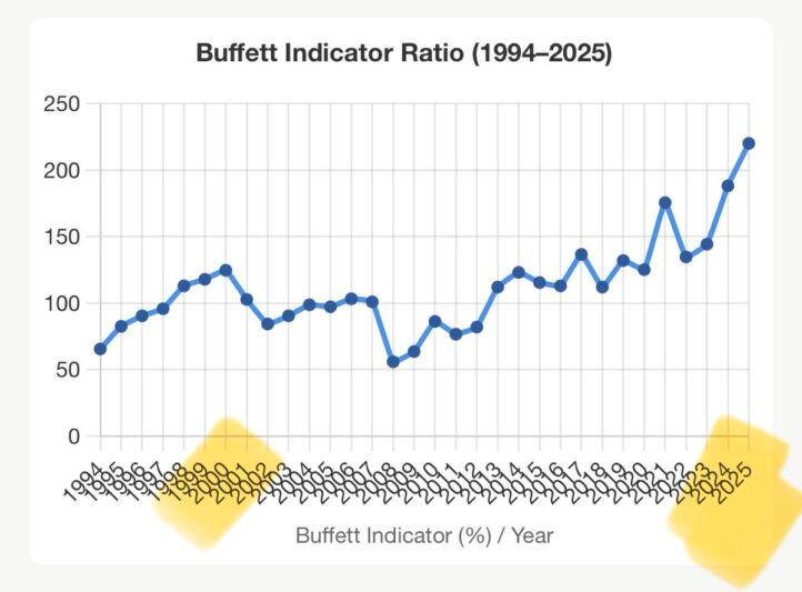
Similarly, the broader, tried and true measure of the stock market’s enormous bloat as measured by the so-called Buffett Indicator shows the same pattern. The point is at the time of the famous Netscape IPO breakout in 1995 it stood at 60% of GDP but now weighs in at more than 220% of GDP or 3.7X higher.
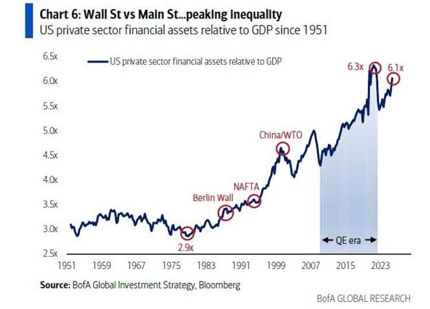
Finally, when we look at a broader measure of financial assets including stocks, bonds, money market funds etc. the story is dispositive. Prior to the Greenspan era total financial assets amounted to about3X nominal GDP, but since the late 1980s the ratio has been heading skyward relentlessly, and now exceeds 6X GDP.
Of course, there was no reason for financial asset values to double relative to national income, especially because the national savings rate has collapsed since the 1990s. Well, except that the Fed flooded Wall Street with cheap credit and hideously low inflation-adjusted interest rates. These distortions caused PE multiples to soar and carry trades to fuel financial speculation like never before. And that’s inflation, too, with a capital “I”.
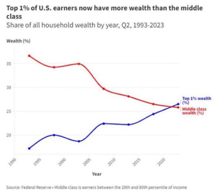
Needless to say, this massive stock market inflation has brought unspeakable paper wealth to the top of the income ladder, where the top 1% of households hold more wealth than the entire middle class, defined as households between the 20th and 80th percentile of income. That compares to a 38% to 10% shares in favor of the middle class as recently as the early 1990s.
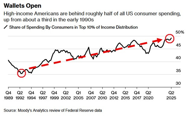
Moreover, this vast shift in wealth holdings has also drastically distorted the main street economy. The US debt-entombed economy is unfortunately driven by consumption spending, but that too has shifted to the top of the economic ladder. The top 10% of households, which own approximately 85% of the stock market, now account for nearly 50% of consumption spending, meaning that when the massive financial wealth bubble eventually goes bust the ricochet through the consumption sector will be brutal.
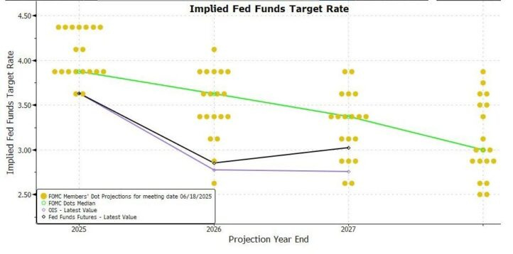
Meanwhile, the fools on the Federal Reserve Board tinker with a “dot plot” guesstimate of where interest rates should be in the next couple of years. But it’s so silly and primitive that that the chart below might as well have come from our eight year-old granddaughter’s art class.
Stated differently, the Federal Reserve is surely a clear and present danger to capitalist prosperity in America, without which the future of personal liberty and democratic governance is dim indeed. Yet the Donald and his MAGA minions are so clueless that they think the route to renewed prosperity is even more dots in the lower reaches of the FOMC’s version of scribble-scrabble below.
Reprinted with permission from David Stockman’s Contra Corner.